Part 1: 30 Days Of Accessibility Testing
I am now halfway through finishing the 30 Days of Accessibility Testing from Ministry of Testing and I figured I should write a blog post about it to collate all of my thoughts so far. I decided to participate to not only expand and verify my knowledge about accessibility more but also to spread word that accessibility is important. It came as an idea from Ben Dowen because on Twitter, we seem to have a lot of content about development but not as much on testing.
In addition, one of my goals for this year is to become an accessibility advocate. At work, one of the projects that I have been part of is to deliver a design system and one of the standards for a design system is accessibility. I helped our team with adding accessibility testing as part of our test strategy and to make sure that we think about accessibility during design, development and testing. However, when I spoke to other testers from other teams if they are doing accessibility testing, their answer was a no. So, I figured that if I talk about accessibility testing more and show ways on what testing activities you can do and share resources, then I might change their minds and get them to also think about doing accessibility testing.
Here Comes 30 Days of Accessibility Testing
Luckily, Ministry of Testing has a 30 days of Accessibility Testing challenge. I personally love public challenges because it keeps me accountable. There were days that I’ve skipped doing the challenge but it was only skipping a day. I make sure to get back to it the next day.
Anyway, let’s look into the challenges in a bit more detail.
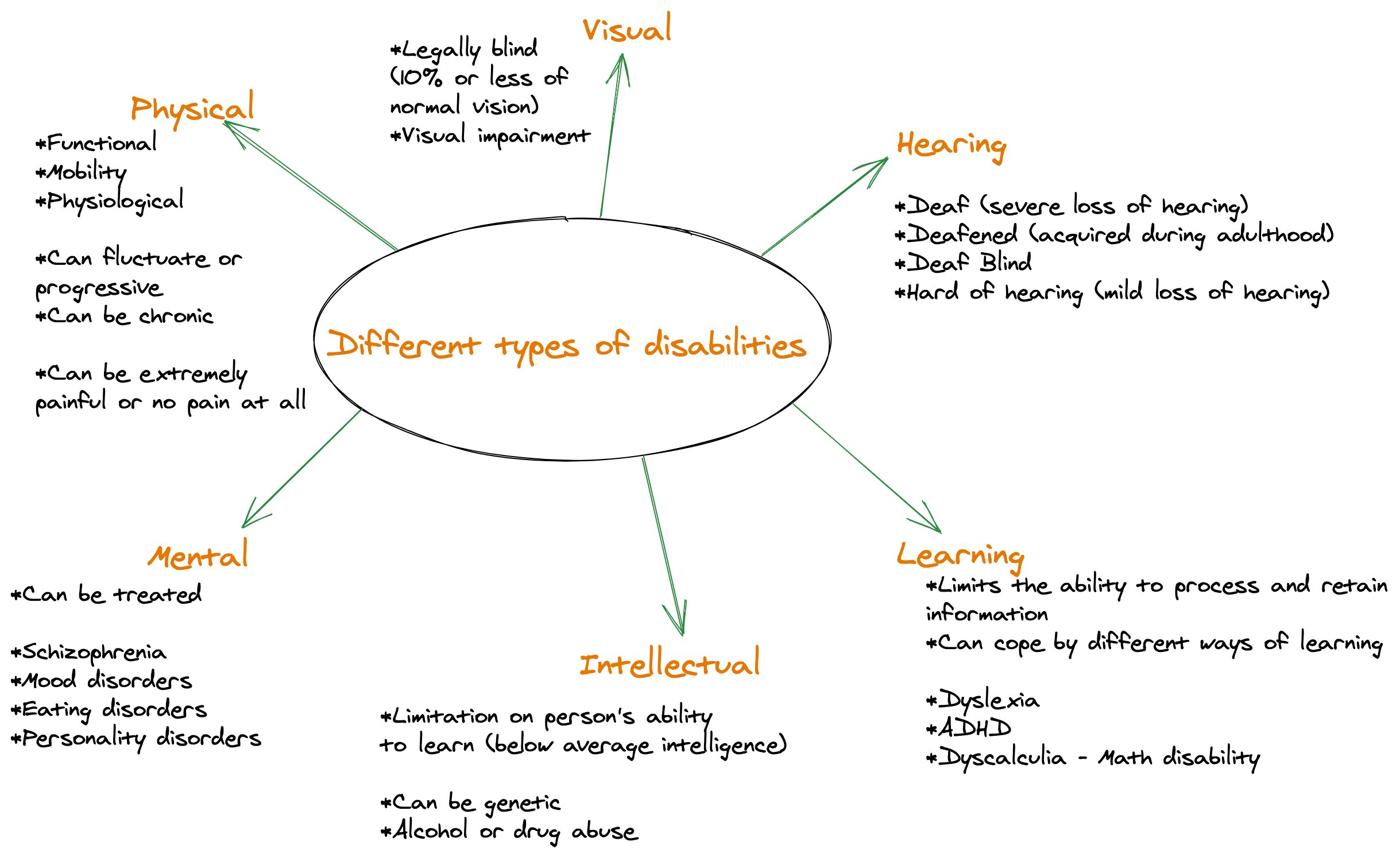
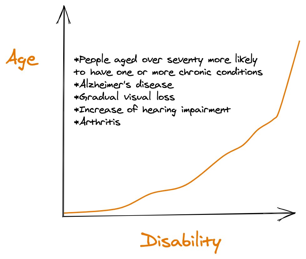
Day 1 was about exploring the different types of disabilities and how aging has a relationship with disability. I made a sketch note which you can find below that documents my findings.

As you can see from the sketch note above, there are tons of different disabilities out there and one of the common misconceptions is that accessibility testing is all about testing for the blind people. This is a complete myth and shows that we also need to focus on the other types such as hearing and physical disabilities.

There seems to be also a relationship between age and disability. As people grow older, the more likely that they will have some sort of chronic conditions, visual loss and increase of hearing impairment. This shows that everyone of us at some point will benefit from products that are accessible.
Day 2 was about using a tool such as WAVE to scan a website for accessibility issues which you can easily install as a browser extension. I’ve been using WAVE in the past already and what I like about this tool is it gives you a clear breakdown of any accessibility issues you have and also accessibility features you have.
Day 3 is about sharing your favourite accessibility testing tool. I made an assumption that the tools cover issues that can be semi-automated or automated so I picked Axe (browser extension, axe cli, cypress-axe), WAVE and Google Lighthouse. I couldn’t settle for one because there is no one tool out there that can catch all accessibility issues.
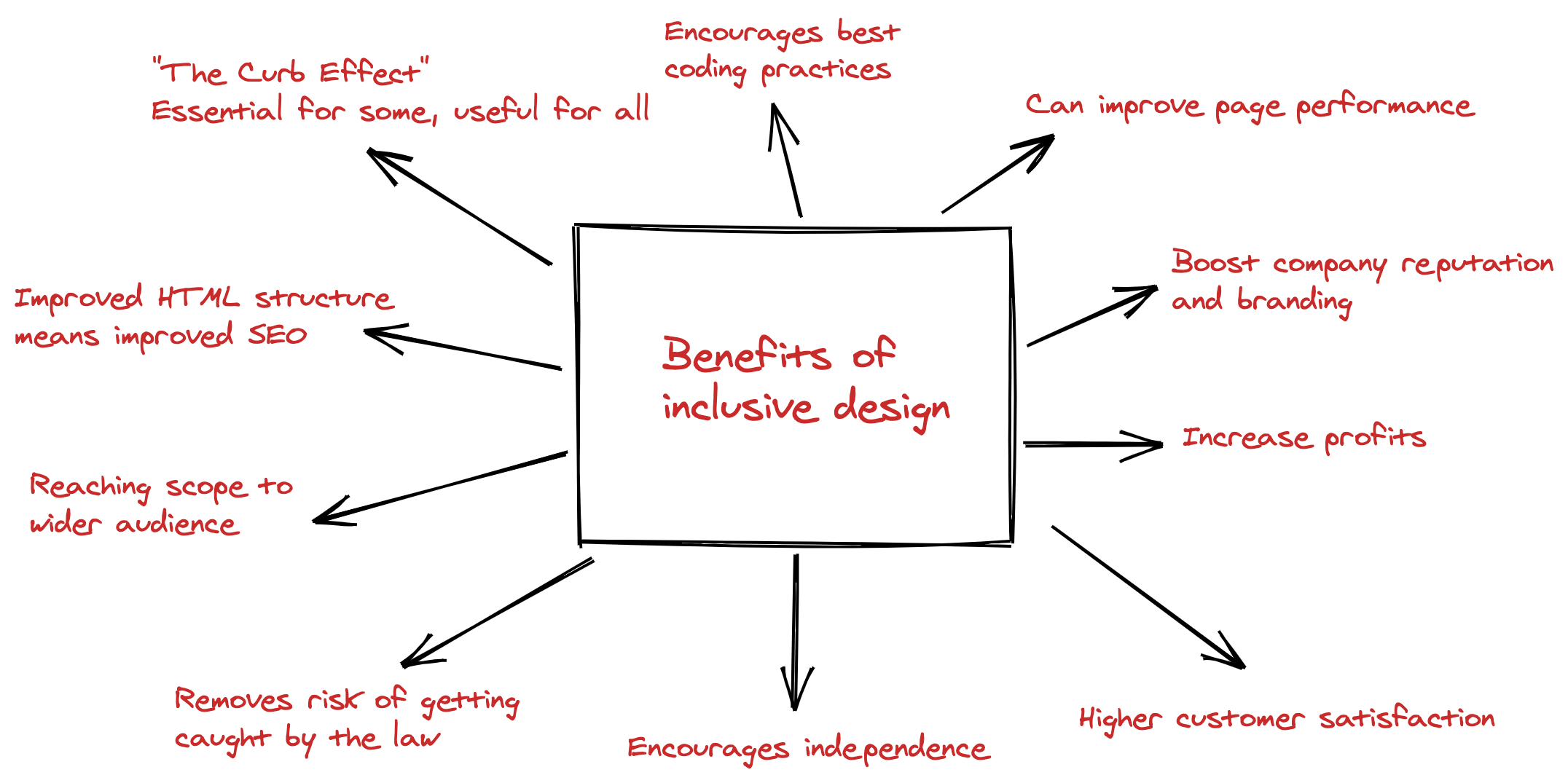
Day 4 is about researching the benefits of inclusive design. I made another sketch note so I could share it to my work colleagues as well. Looking at the sketch note below, there are tons of benefits such as “The Curb Effect”, reaching a wider audience, increase in equity and profits and higher customer satisfaction to name a few.

Day 5 is to read the 12 guidelines of WCAG 2.0 and to write a short post on one of them. Since the challenge was announced in 2017, WCAG 2.1 was not introduced yet. I decided to talk about the guideline about keyboard accessibility.
If you are only starting out and want to reach Level A conformance, your website should be fully accessible via keyboard only. This includes link navigations, button clicks, form submissions to name a few. Many users with motor disabilities will have issues using a mouse and will rely on a keyboard alone. So if your website doesn’t provide a clear focus indicator or lacks structure in navigation, then you’re excluding a lot of users to have a great user experience. Keyboard accessibility testing is one of the checks that need human intervention and cannot be caught by automated tests so it’s essential to include this as part of your accessibility checks.
Day 6 was about researching what assistive technologies are. Assistive technologies refers to equipment, devices or programs that can help improve or maintain someone’s life. It ensures that people with disabilities can perform their routines on a day-to-day basis. Examples of assistive technologies range from wheelchair, screen readers, braille, hearing aids, closed captioning to name a few.
I was researching braille and stumbled upon Innovision Tech. They have created the world’s most affordable digital braille which you can use both as a standalone braille and also connected to your digital devices. You can find a demo on how the digital braille works by watching this video - Braille Me demonstration.
Day 7 was all about the keyboards! For this challenge, I created a tweet using my keyboard only.
Day 8 was to read a book about accessibility. I read the first chapter of Web Accessibility: Web Standards and Regulatory Compliance. I made some sketch notes again in case you want a shorter version.

Day 9 is to disable images in your browser and see if you can still understand what’s been presented to you. I tested a few websites and while some websites have descriptive alt texts, there are still websites out there that don’t have alt texts or it exists but it’s not very descriptive.
Tip: To disable images quickly on your browser, if you are using Chrome you can download this chrome extension - Images On/Off extension.
Day 10 was all about testing with a screen reader. I use VoiceOver since it comes built-in on Apple devices and it made me rethink the way I create my blog posts as some of my images don’t have alt text so when I used a screen reader, it’s hard to understand. So one useful tip for content creators is to always have alt texts on your images so it’s accessible by everyone. There is of course an exception to this rule. If the image is for decoration only, then still add the alt text attribute but leave it as an empty string. If an alt text is empty, it will be skipped by your screen reader.
Day 11 was screen reader related again. This time, turn your screen off and rely on a screen reader alone. Because I’ve only used VoiceOver on desktop, I realised I haven’t used VoiceOver on my mobile so for day 11, I decided to close my eyes and enabled VoiceOver on my iPhone. It took me a while to go to the app that I want and the gestures are handy but takes some time getting used to.
Day 12 was to share an article about accessibility. This article titled Web accessibility guidelines: from compliance to inclusive design by James Sheasby Thomas about web accessibility guidelines is very insightful and a great read overall. If you haven’t read it yet, please do!
Day 13 was to share a video about accessibility. If you’re in a hurry and want to know about web accessibility in 60 seconds then this video is for you - What is Web Accessibility in 60 seconds.
Day 14 was to find a problem that might affect someone who is deaf. If you have audios or videos embedded on your website but it doesn’t have captions/subtitles or transcripts, then this makes the content inaccessible to people who have hearing disabilities. Personally, I turn subtitles on because sometimes I can’t understand what I’m watching especially if my toddler is too loud.
Day 15 was to find a problem that might affect someone who is colour blind. I decided to test this on amazon’s website and searched for women’s t-shirts, changing the colours to mimic how a person who is colour blind sees the t-shirts.
There you have it, my first 15 days of Accessibility Testing! I’ll be doing another round up post after I finish the whole challenge so keep an eye out for that.